
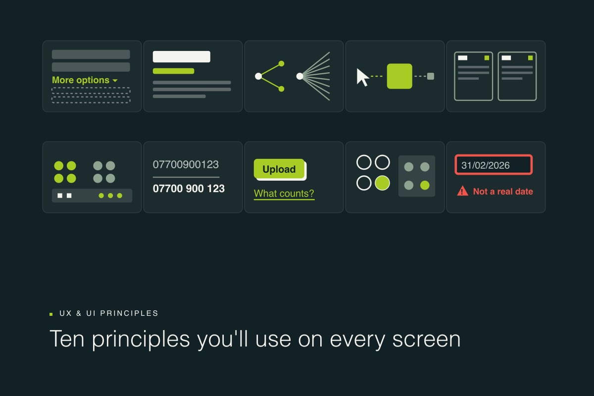
Every design conversation eventually arrives at the same handful of ideas. Why does this screen feel busy? Why do people miss that button? Why does the form that looked fine in the mock-up fall apart in testing? Behind most of those questions sits a principle that someone has already named, studied and written down.
This is the set we reach for most at Digital Forest. The first ten apply to almost every screen we design. The lists that follow help put a name to what you see in research and critique, which makes it far easier to fix.
One note before the list. These are prompts, not rules. When two principles pull in opposite directions, and they often do, test with real users and let the evidence decide.
Ten principles you'll use on every screen
Progressive disclosure
Show what is needed for this step and reveal advanced or rare options on request. Most people never need the long tail of settings, so keep it out of their way until they ask.
For example: Ask whether an order ships to a different address before showing a second address form.
Visual hierarchy
Size, weight, colour and position tell people what matters most and what to read first. If everything shouts, nothing is heard.
For example: One primary action per screen, in the brand accent, and everything else quieter.
Hick's law
The more options there are, and the more complex they are, the slower the decision. Reduce choices, group them, or stage them across steps.
For example: One recommended plan up front, with the full comparison a click away.
Fitts's law
The time it takes to reach a target depends on its size and distance. Make the important targets big and put them close to where the hand already is.
For example: Tap targets of at least 24 by 24 pixels, which is the WCAG 2.2 minimum.
Jakob's law
People spend most of their time on other sites and expect yours to work the same way. Use conventions and save your invention for what makes you different.
For example: A proven checkout pattern rather than a novel one.
Gestalt grouping
Things that are close together, look alike or share a boundary are read as one group. Proximity, similarity and common region do a lot of quiet work.
For example: Labels sit tight to their fields, with more space between fields than within them.
Chunking
Working memory is small. Miller's famous seven plus or minus two is nearer four in later research. Break information into meaningful chunks so it can be held and compared.
For example: A long form split into short steps, and a phone number shown as 07700 900 123 rather than one run of digits.
Affordances and signifiers
An affordance is what an element lets you do. A signifier shows that you can. Buttons should look pressable and links should look clickable.
For example: Never dress a link up as plain text, or plain text up as a button.
Natural mapping
Lay controls out so they mirror what they affect, and their effect becomes obvious without a label. Don Norman's hob rings are the classic example.
For example: Progress steps in the same order as the journey they describe.
Never colour alone
Never convey information through colour only. Pair it with text, an icon or a pattern so it works for everyone, including people who cannot see the colour. This is WCAG success criterion 1.4.1.
For example: A field error shows a red border, an icon and a plain-English message that says how to fix it.
Nielsen's ten usability heuristics
Jakob Nielsen's heuristics date from 1994 and were updated in 2020. They remain the most useful checklist we know for reviewing an interface, because each one describes a failure you will recognise the moment you see it.
- Visibility of system status. Always show what is happening, and show it promptly.
- Match between the system and the real world. Use the user's words and concepts, not internal jargon.
- User control and freedom. Provide clear exits: undo, back and cancel.
- Consistency and standards. The same thing should look and behave the same way everywhere.
- Error prevention. Design out slips and mistakes before they can happen.
- Recognition rather than recall. Keep options visible instead of relying on memory.
- Flexibility and efficiency of use. Shortcuts for experts that do not confuse newcomers.
- Aesthetic and minimalist design. Every extra element competes for attention.
- Help users recognise, diagnose and recover from errors. Plain-language messages that suggest a fix.
- Help and documentation. Easy to find, focused on the task and concise.
Laws and effects worth knowing
These come from psychology and human-computer interaction research, and most are collected in Jon Yablonski's Laws of UX. They explain why certain patterns keep working.
- Tesler's law. Some complexity cannot be removed, only moved. Let the system absorb it rather than the user.
- Doherty threshold. Responses under about 400 milliseconds keep people in flow. When something takes longer, show progress.
- Aesthetic-usability effect. Attractive designs are perceived as easier to use, which can hide real usability problems during testing.
- Peak-end rule. People judge an experience by its most intense moment and by how it ends.
- Serial position effect. The first and last items in a list are the ones people remember.
- Von Restorff effect. The item that looks different stands out and is remembered.
- Zeigarnik effect. Unfinished tasks stay on our minds, so show people what is left to do.
- Goal-gradient effect. Motivation rises as people near the finish. Show progress and the end in sight.
- Postel's law. Be liberal in what you accept, such as spaces, dashes and mixed case, and strict in what you output.
Terms you will hear in the room
- UX and UI. UX is the whole experience of a product or service. UI is the surface people actually interact with.
- Mental model. What a user believes about how something works, whether or not it is true.
- Cognitive load. The mental effort a task demands. Reduce whatever is extraneous.
- Interaction cost. The total effort, in clicks, reading and waiting, needed to reach a goal.
- Information architecture. How content is organised, labelled and found.
- Fidelity. How finished a design looks, from sketch to wireframe to high-fidelity prototype.
- Design system. Shared components, patterns and guidance that keep a product consistent.
- Microcopy. The small text in an interface: labels, hints, buttons and error messages.
- Deceptive pattern. A design that tricks people into acting against their own interests. You may know it as a dark pattern.
- POUR. The four pillars of WCAG accessibility: perceivable, operable, understandable and robust.
When principles disagree
Progressive disclosure says hide the rare options. Recognition rather than recall says keep options visible. Both are right, and which one wins depends on who is using the screen and how often. That is why the honest answer to most design arguments is a usability test rather than a stronger opinion.
Use this list to name what you are seeing. Then go and watch someone try to use it.
Sources: Nielsen, 10 Usability Heuristics for User Interface Design (1994, updated 2020); Norman, The Design of Everyday Things (2013); Yablonski, Laws of UX, 2nd edition (2024); W3C, Web Content Accessibility Guidelines 2.2.